
Tacklit.com is the official marketing site for Tacklit, a Care Delivery System designed to empower clinicians, psychologists, and healthcare organizations to deliver client-centered services with ease. Built on Framer, that is a major place where potential customers discover the product, learn how it works, and may decide to get started or reach out.
Background
My role
Challenges
The original Tacklit.com was limited to a few essential pages: homepage, product overview (Care OS and Engage), pricing, about us, a single case study, and a basic “Book a Demo” form. While functional, the site lacked depth, clarity, and strategic storytelling—resulting in poor SEO visibility and lower conversion potential.
Key issues included:
Flat site structure and minimal content depth
Weak product storytelling and unclear pricing logic
Outdated UI and placeholder components that reduced credibility
Goals
Increase demo conversion rates through structured product storytelling
Improve SEO performance and content discoverability
Build trust and authority with a more corporate, professional tone
Clearly explain Tacklit’s product tiers and security infrastructure
Ensure responsive design across all devices to support accessibility and reach
Design Process
Step 1: Research
I began by speaking with internal stakeholders—particularly the founder and sales team—to understand business goals and customer pain points. The sales team emphasized the need for clearer product breakdowns and stronger messaging to support enterprise-level pitches. We also benchmarked competitor sites across the healthcare SaaS space for structure, content strategy, and tone.
Step 2: UX Audit of the Existing Site
My findings:
Minimal site architecture with only a few functional pages
Unclear hierarchy and inconsistent pricing presentation
Placeholder components and dummy content reducing professionalism
Lack of SEO and accessibility optimization

Step 3: UX Design Strategy & Decisions
To support Tacklit’s growth and reposition it as an enterprise-ready solution, I focused on scalable architecture, clear messaging, and targeted user flows.
Key Page Expansions:
Capabilities Page: A detailed breakdown of each feature within Care OS, designed to help clinicians and decision-makers understand how Tacklit supports their daily workflows.
Expanded Product Page: Tacklit 360—now has a dedicated page with focused messaging, target audience, and value proposition to support informed decision-making.
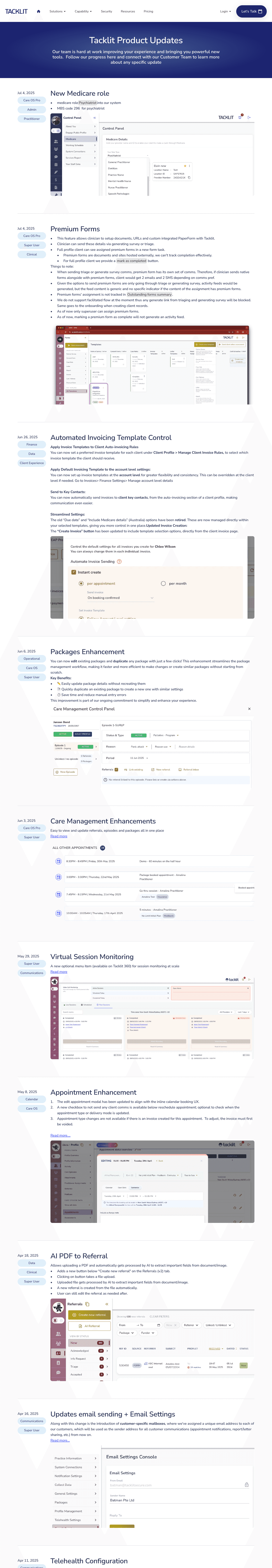
Product Update Page: A changelog-style section highlighting recent feature releases and improvements, increasing user trust and showing that Tacklit is actively evolving based on user needs and feedback.
Resources Library Page: A centralized hub for downloadable guides, tutorials, video walkthroughs, and whitepapers. This section helps educate potential clients while reinforcing Tacklit’s thought leadership in the healthcare SaaS space.
Policy documentation Page: Includes key legal documents such as Privacy Policy, Terms of Service, and Data Protection Policies—essential for enterprise trust, security reviews, and procurement processes.
Step 4: Visual Design
My design approach focused on clarity, professionalism, and conversion:
A clean, trustworthy visual tone tailored for clinical decision-makers
Thoughtful use of whitespace, clear typography, and strong hierarchy
Fully responsive layouts across desktop, tablet, and mobile
Micro-interactions and scroll effects to improve engagement without overwhelming users
Used CMS collections in Framer for Capabilities and Product Update pages, enabling future content updates without design changes.

Framer CMS
Step 5: Collaboration Process
I collaborated closely with:
The founder to shape product messaging and align positioning
A developer to implement custom code on the Pricing page and handle technical SEO
Step 6: Testing and Launch
Before launch, I conducted extensive testing in Framer to ensure smooth animations, cross-device responsiveness, and error-free navigation. I tested on multiple browsers and breakpoints and fine-tuned interaction timings and responsiveness for smoother user experiences. Make sure all form submissions, CTAs and demo flows were verified end-to-end.
Step 7: Post-Launch
The work didn’t end at launch. I now continuously monitor the site to evaluate engagement, bounce rates, and conversion. I maintain the product Updates page to reflect new releases.
Visual Style
The visual language for Tacklit.com was intentionally designed to convey professionalism, clarity, and trust—aligned with our target users: clinicians, psychologists, and decision-makers in healthcare organizations.
(To view the live site and final outcome, head to the conclusion section.)
Revamp Homepage:
Before
After

Revamp Pricing Page
Before
After

Capabilities Page

New Product Page
Product Update Page
Resources Library Page

Policy documentation Page

Conclusion
Redesigning Tacklit.com was both a strategic and hands-on challenge. It pushed me to learn Framer quickly and take full ownership of the site's architecture, design, and implementation. Over the past year, I’ve evolved into a more product-minded UX designer—thinking beyond screens to consider positioning, business impact, and sustainable design systems.
This project taught me that messaging is UX. Much of the work was not just about how the site looked, but how we told the right story to the right audience—clearly and credibly.
The new Tacklit.com positions us as a scalable, trustworthy partner for healthcare teams. With clearer messaging, structured content, and a flexible system built for growth, the site now supports long-term business goals and drives more qualified leads.